


1
2
3
4
5
6
7
8
9
10
11
12
13
14
15
16
17
18

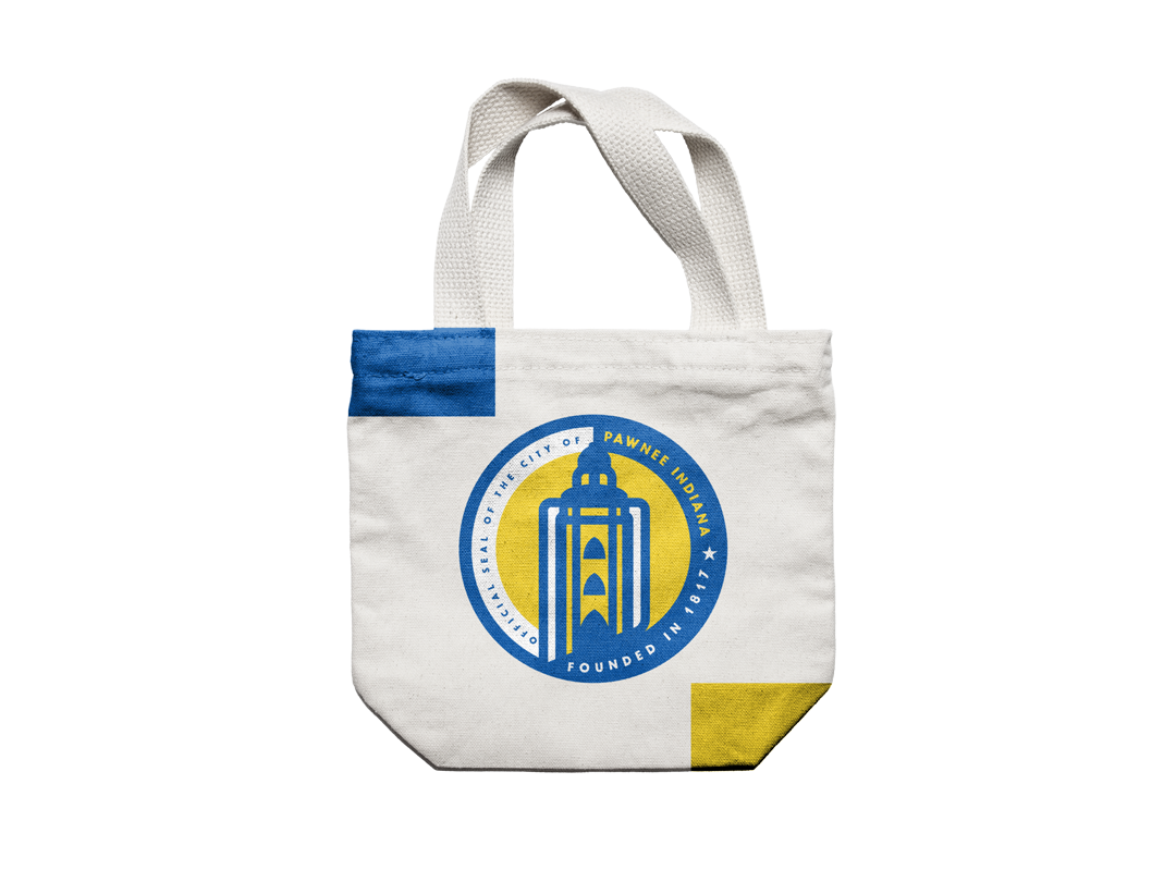
Re-branding project for the city of Pawnee, Indiana. Including typography, logo design, seal, apparel design, and more!
My idea for the brand surrounds an illustration of City Hall. In my research of other municipal brand projects, I found that a lot of them have an iconic image at its center. The city hall icon is housed with a curved shape of the state of Indiana. I could have just used a circle or square but I thought it would be great to have that reference to make the overall mark unique.
Now with the colors, I took my inspiration from the current seal and flag design. I applied the blue and yellow to the designs after I finalized the shapes. Always focus on the design first and make sure it works before adding color. I utilized Adobe Color to build a complete color scheme. I used the eyedropper tool to pull the blue straight from the current seal and then used the Split Complementary color harmony rule to produce the other complementary colors.